In the world of interior design there aren’t a lot of hard and fast rules, rather guidelines, if you will. But even then you’ll see a famous interior designer’s newly revealed home that defies all the “rules” you thought sculpted the way a room should look. I am constantly being surprised by photos popping up on my Instagram feed posted from fellow designers I follow that make me say “Huh, I would have never put that together – but it looks great!”
These instances, however, are the outliers in this industry. And in order to get to that point, you of course have to start from the beginning. Which is what this post focuses on today – an introductory guide on what to look for when mixing patterns and how to know if what you’re selecting clashes or not. Let’s get started!
It’s all about balance….
Which is basically a rule of thumb for everything in life, am I right? Well, same thing goes for coordinating patterns in your home decorating project. What do I mean by this? When mixing patterns, the overarching goal is to find patterns that balance one another out. Here are some examples:
")
All pattern swatches are from Schumacher (Chiang Mai Dragon, Deconstructed Stripe, Nakuru Linen Velvet)
In the above example, the Chiang Mai dragon (left) print feels heavier because it has a lot of color and a busy motif (aka pattern). You want to pair this with something that has a lighter visual weight like the deconstructed stripe (bottom). The deconstructed stripe has a lot more white space and a simple motif compared to the Chiang Mai.
The dotted dusty blue pattern (right) is a velvet/linen blend which is heavier than both of the other patterns because of the use of velvet and it’s condensed motif. This fabric brings in texture both visually and tactically which also lends well to the overall balance. It offers the least amount of white space compared with the Chiang Mai and the deconstructed stripe which is another reason why it’s visual weight is considered heaviest.
All three work well together because they have similar colors and don’t have competing weights – they BALANCE one another out.
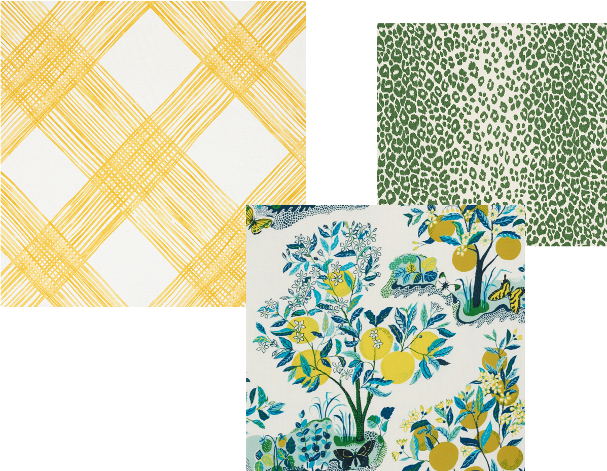
All pattern swatches are from Schumacher (Traverse, Citrus Garden, Iconic Leopard)
For this next set of patterns, you’ll notice all three are predominantly different colors. We have the yellow trellis pattern, multi colored floral motif with lemon trees and butterflies, and a green and white animal print. Even though they are all vastly different, they still are connected through color.
If you select one pattern that has multiple colors (the lemon tree/butterfly motif), try selecting two other patterns that share one of its colors (the yellow trellis makes the lemons pop while the green animal print brings out the green from the leaves and grass). This accomplishes a balance through color because one is yellow, one is green, and one shares both those colors.
These patterns also work well together because they exhibit different weights, as learned in the last example. The leopard pattern being the most dense, the floral pattern being the second, and the yellow trellis feeling the lightest (most white space).
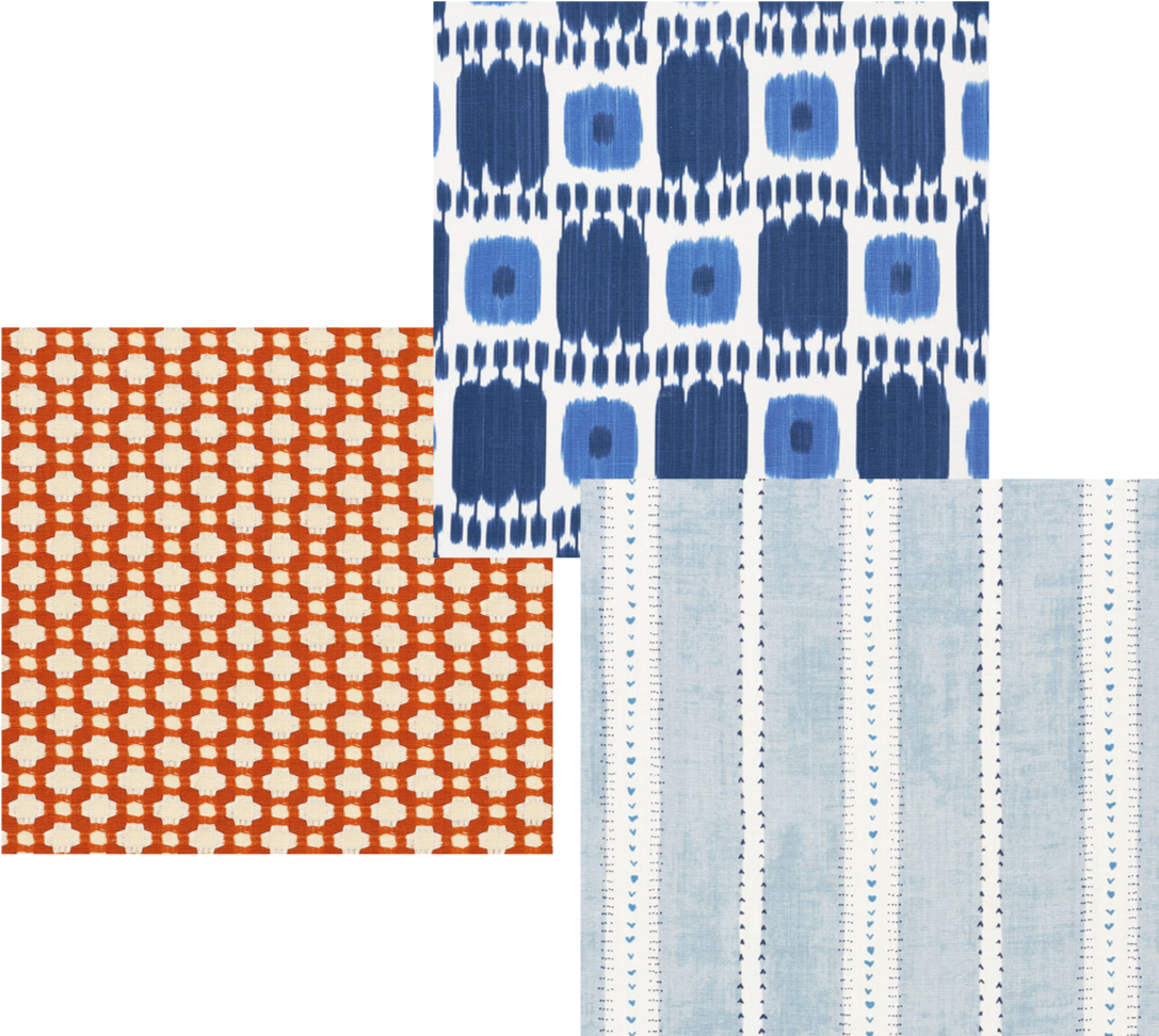
All pattern swatches are from Schumacher (Betwixt, Kandira, Amour)
At first glance these three patterns look vastly different than one another, but that doesn’t mean they can’t go together. In this combination of patterns, we’ll be comparing scale. Each pattern has a different size (scale) pattern – the orange motif being the smallest with it’s repetition of small geometric shapes, the blue ikat having a medium scale because it is larger than the orange motif, and the wide blue stripe having the largest scale out of the three. These all work together because each pattern’s scale does not compete with one another.
Side note: another reason these patterns all work together is because blue and orange are complementary colors (opposite of each other on the color wheel). When in doubt of if two different colors go together, checking the color wheel can be helpful.
Here are some real life examples of how patterns work together in a space:
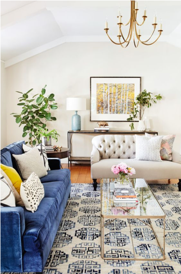
Photo credit: Style Me Pretty
This room is the perfect example of a well balanced room with multiple patterns working together to form a cohesive space. The fact that there are solid colors mixed in and that some of the patterns are spaced out from one another are a large factor in why this room works. The blue and off-white patterned rug picks up the colors in both sofas blending them together well.
The black and white abstract pillows on the blue sofa don’t clash with the rug because they are different style (the rug has a geometric pattern and the pillows are abstract). Both patterns also have different scale and visual weight. Same goes for the black and white polka dot pillow on the blue sofa and the light blue polka dot pillow on the cream sofa. The black and white polka dot pillow has similar coloring as the abstract pillows but a different pattern that holds different visual weight and scale.
The light blue polka dot pillow comes from the same color family as the sofa and rug making them connect, yet it also carries a different visual weight and scale so as to not clash with any other pattern in the room. The pink pillow and yellow pillow offer pops of color, and even though their colors don’t match with the other textiles, that’s ok! Both pillows have a heavier visual weight and scale than the other patterns in the space, so as to not compete.
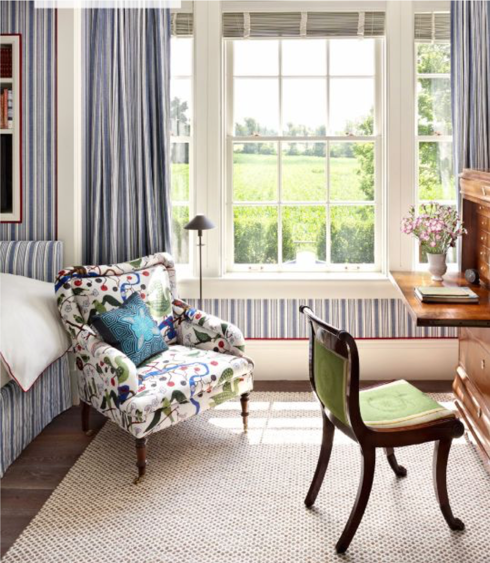
Photo Credit: Sarah Bartholomew
The five patterns you see in this space are the fabric of the armchair, desk chair, curtains/wallpaper, pillow, and rug. The predominant pattern in this is the matching striped wallpaper and curtains. The colors in the stripes are shared with the floral pattern on the armchair. Both patterns carry different visual weights and have entirely different styles (historically stripes and florals pair well together) which is why they work. The mostly solid blue pillow ties in with the color of the stripes and floral patterns, as does the solid green fabric on the desk chair. The rug has a small pattern but is neutral enough to not disrupt or compete with any of the other fabrics – making everything work!
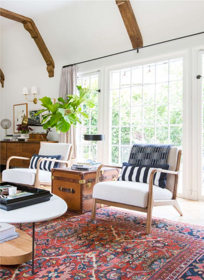
Photo Credit: Emily Henderson
The rug, chair pillows, and throw blanket are the three patterns to focus on here. They all share a similar color blue and carry different visual weights as well as overall pattern style. Stripes, geometric, and a vintage rug motif. The overall white space used in the fabric of the chair, coffee table, and walls also helps balance out the patterns.
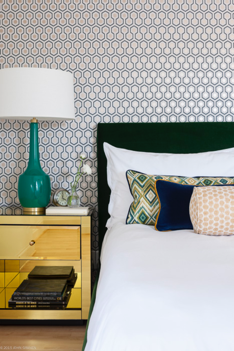
Photo Credit: John Granen for Kimberlee Marie Interior Design (Mercer Island Modern Project)
The three main patterns to note are in the polka dot bolster pillow, geometric lumbar pillow, and geometric wallpaper. All three carry different visual weights and share similar colors (teal, white, and yellow/gold). Sometimes geometric patterns do not work well together, but in this case they do because of how different the patterns are. The hexagon shapes in the wallpaper have more white space than the heavier zig zag pattern in the pillow. It also helps that both patterns are separated by white sheets, and a solid dark green velvet headboard. These patterns are also applied to different materials which is another reason they work together – one as a lightweight wallpaper and one as a heavier velvet.
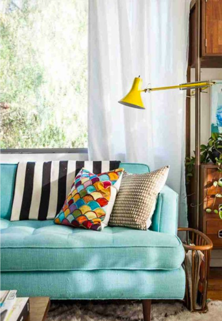
Photo Credit: Unknown source (Pinterest)
The two throw pillows and blanket are very different in terms of pattern, color, and visual weight. Which is why they work together! These three patterns may not have anything in common with one another but if you take a look around the room, you’ll notice they speak to other elements. For instance, the color of the neutral pillow is in the same color family as the textured rug under the sofa. The multicolored pillow picks up color from the lamp and the sofa, and the throw blanket can be paired with just about anything because of it’s simple pattern and black and white color. The warm brown wood tones in the coffee table, side table, magazine holder, and sofa legs also blend well together which creates consistency in the space. When there is consistency in some form, it allows for other areas of the space to be a little more random. It’s all about strategy!
Other helpful things to consider…
- When mixing patterns always try to have solid colors to help break things up
- Distributing patterns evenly throughout a space helps balance the room out
- Rule of three: use at least three patterns or an odd number of patterns
- Focus on the scale of pattern, above all else – this is probably the most important factor in mixing patterns
- If your eyes get tired or you get dizzy just looking at patterns put together, it probably means they don’t go together 🙂 take a deep breath, don’t try to overthink things (I know it’s hard not to!) and just go with your gut
When I want to get inspiration or confirm what I’m envisioning is either yay or nay – I take to Pinterest or Houzz to help me visualize. I search “living room inspiration” or something more specific like “moody chic living room” – whatever it is I need help with – to see what works (or doesn’t work) for other people out there. When you see something that grabs your attention, stop to take it in and analyze WHY you like it or don’t like it. What patterns do you see? How do they connect with one another? Are there other textures involved? What is it that made you gravitate towards the picture? If you start asking yourself these kinds of questions you’ll start to figure out why the elements in a space space do or don’t work.
Keep in mind that with interior design it is heavily based on the eyes of the beholder – what you think looks fabulous, your friend or neighbor may not agree with. It’s just like fashion or anything else in this world, everyone has their own opinion.
You are most likely reading this because you are wanting to implement these tips into your own home. So since it’s YOUR home you’re decorating, go with whatever brings YOU joy. If you think two patterns go well together, try it out for awhile. You may still love it in a few months or hate it in two weeks. You’re allowed to change your mind!! Confession: I do it all the time. This wonderful world of design is constantly changing, trends are always going out or coming back in. So don’t get too down on yourself or over analyze too much. Just have fun with it!
Please feel free to comment below or reach out to us if you have any questions about this post – we are happy to help answer! If there are other topics you want to know more about or want to see a part two of this post, don’t hesitate to reach out 🙂