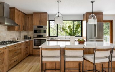
At a loss for how to put the finishing touches in your living room? Or have no idea where to start when styling your kitchen? Maybe that bookshelf in your office has been empty for far too long… Whatever the case, we’ll give you the low down so you can finally have your home styled like a pro!
Styling is the last piece to a well curated home, and while commonly overlooked it is essential. Without styling, your walls, shelves, hard surfaces and table tops go bare. Styling should look effortless, and isn’t necessarily the first thing you notice when you walk into a space – but it’s definitely something you notice when it’s absent!
It’s not something that comes naturally to a lot of people, but with a little guidance you’ll learn how to style in no time. We’re giving you the tips and tricks we use on a daily basis when styling clients homes, our favorite pieces to use for different areas of the home, as well as some of our favorite curated vignettes for inspiration. So without further ado… here’s our rendition of interior styling 101, if you will!
There are a few rules of thumb we like to use when styling surfaces such as your coffee table, dining table, or mantle:
- Creating Visual Balance
- Adding Dimension: Stacking and Layering
- Rule of Three
Creating Visual Balance
First thing’s first – the most important rule to styling is creating visual balance. Visual balance is the sense that design is equally weighted on both sides of it’s vertical center. Visual balance can be accomplished in many different ways, some of the most common being symmetrical and asymmetrical (flashback to grade school anyone?). Now this does not literally mean that the pieces you use to style have to be the same weight – visual balance is an illusion that when the pieces are grouped together they look like they visually balance each other out. This can be done through varying heights, shapes, colors, textures, orientation, and position of objects.
Here are some examples of how you create visual balance through styling:
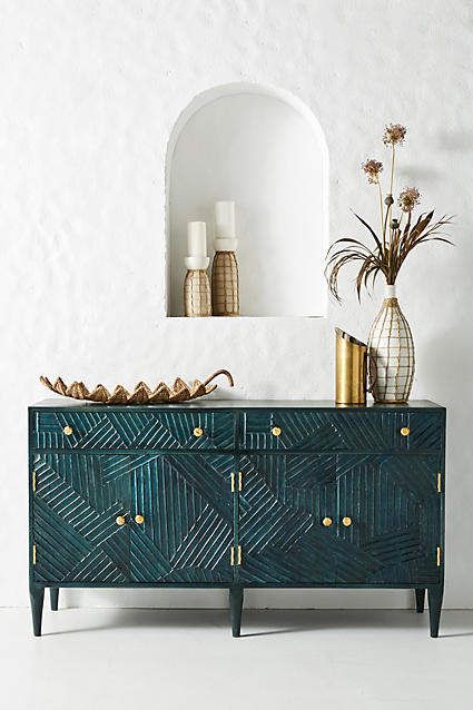
The styling of this console table achieves visual balance because of the objects varying sizes, colors, and textures. The short and wide gold leaf bowl paired with the large candlestick holders sitting in the nook above visually balance the weight of the tall vases. All objects have similar textures and colors which also balance one another out.
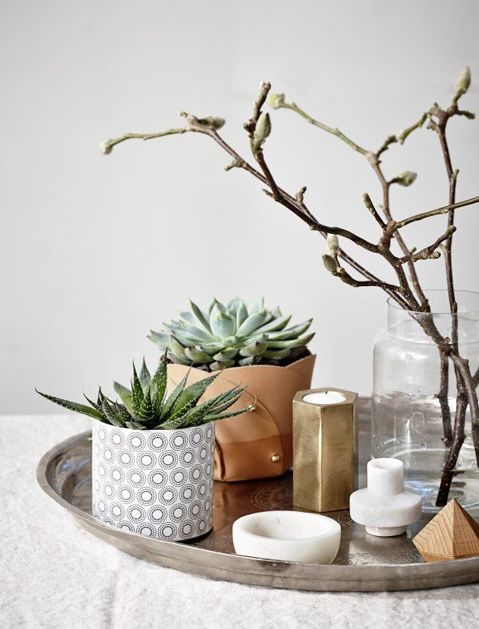
The varying heights and sizes of these objects help to achieve visual balance. The tall twig that hangs over the succulents helps to fill the space above them while the smallest objects (mini marble bowl, wood prism, and hexagon candle) fill the space below the succulents since they are at a medium height in comparison. It also helps that all pieces are made of different materials. The ceramic succulents visually look heavier than the twig in the glass jar but since the twig is so much taller it helps balance the succulents out.
Create Dimension: Stacking and Layering
Other ways to create visual balance is through stacking and layering objects. You’ll see a lot of well styled vignettes incorporate stacks of books to add height or put objects in front of one another to create a layered look. These two techniques are a playful way of using height, orientation, and position to accomplish visual balance.
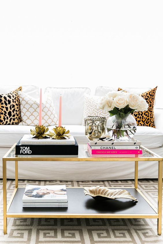
Keeping the eye interested, a mix of materials, and the varying use of color are just a few of the reasons why this coffee table is so well styled. It provides visual balance by adding objects to stacked books, achieving similar heights without using the same objects (which creates a more interesting look).
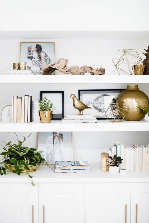
We love how the styled shelves above radiate with visual balance. The similar use of color and texture placed strategically in different locations of the shelves help to guide the eye and not let it sit in one place. You’ll also notice the clever use of layering with picture frames leaned up against the back wall and tucked behind objects in the foreground. The horizontally stacked books also give height to objects that are too similar in height to their surroundings – helping to fill negative space and achieve visual balance.
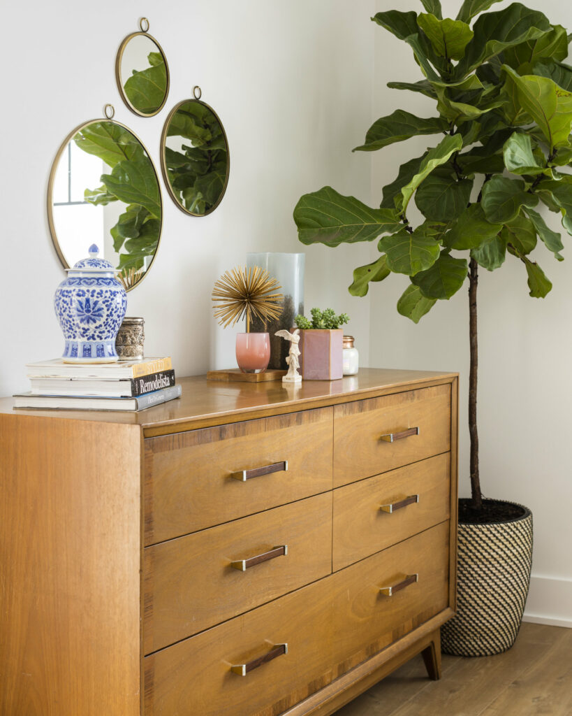
Adding a tall plant next to a dresser or credenza and wall decor above the surface your styling also contributes in the overall visual balance of the vignette. It helps bring height if you are styling with pieces that are otherwise shorter. Greenery and mirrors are always a great way to add more dimension and interest to any space you are styling. Mirrors typically make rooms feel larger and greenery is just so pretty 😉 If you want to see more pictures from this project, head on over to our Backyard Guest House showcase.
Rule of Three
In interior design, the rule of three suggests that objects grouped together in odd numbers are more appealing to the eye. This rule takes many different forms. It can be used when grouping objects together that are similar to one another or completely different. It can also be applied to “footprints” rather than strictly objects. What we mean by this is, a “footprint” could be considered a tray that is holding multiple objects. The tray itself could count as one footprint on a surface when it’s sitting next to a stack of books (also one footprint) and a vase. Thus, three different footprints put together that abide by the rule of three. Here are some examples of vignettes that use the rule of three:
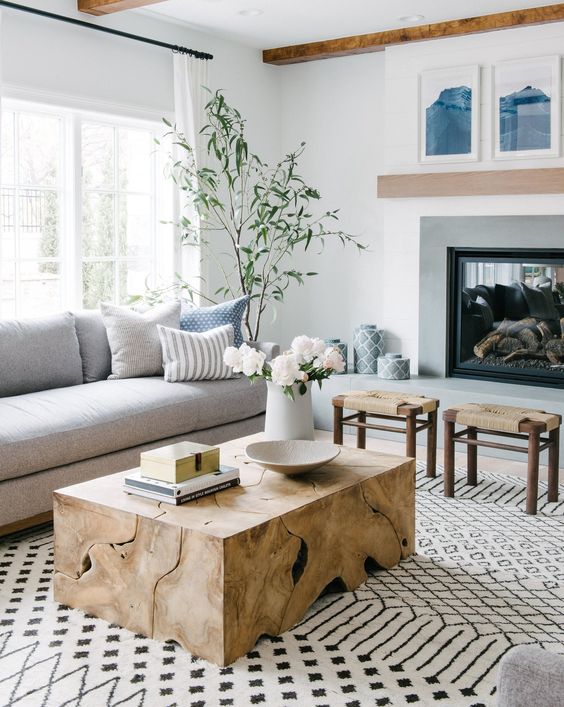
This living room coffee table by Studio McGee is a perfect example of the rule of three reflected as three footprints (a stack of books, a bowl, and a vase with flowers)
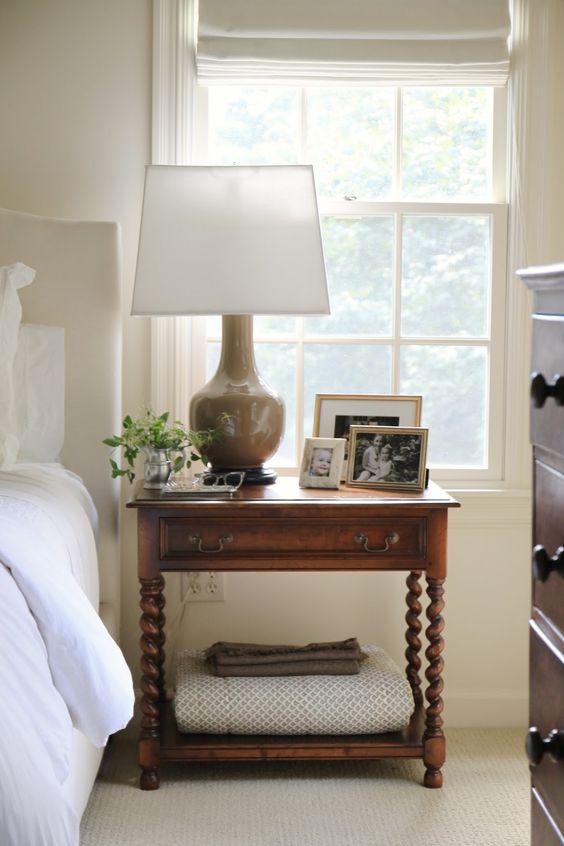
This rule of three example shows three picture frames (all similar objects) grouped together on a nightstand. They are paired with two other objects (the lamp and small vase with ivy) which totals an odd number of objects, thus following the rule of three. I’ll get into why these items pair well together in a bit.
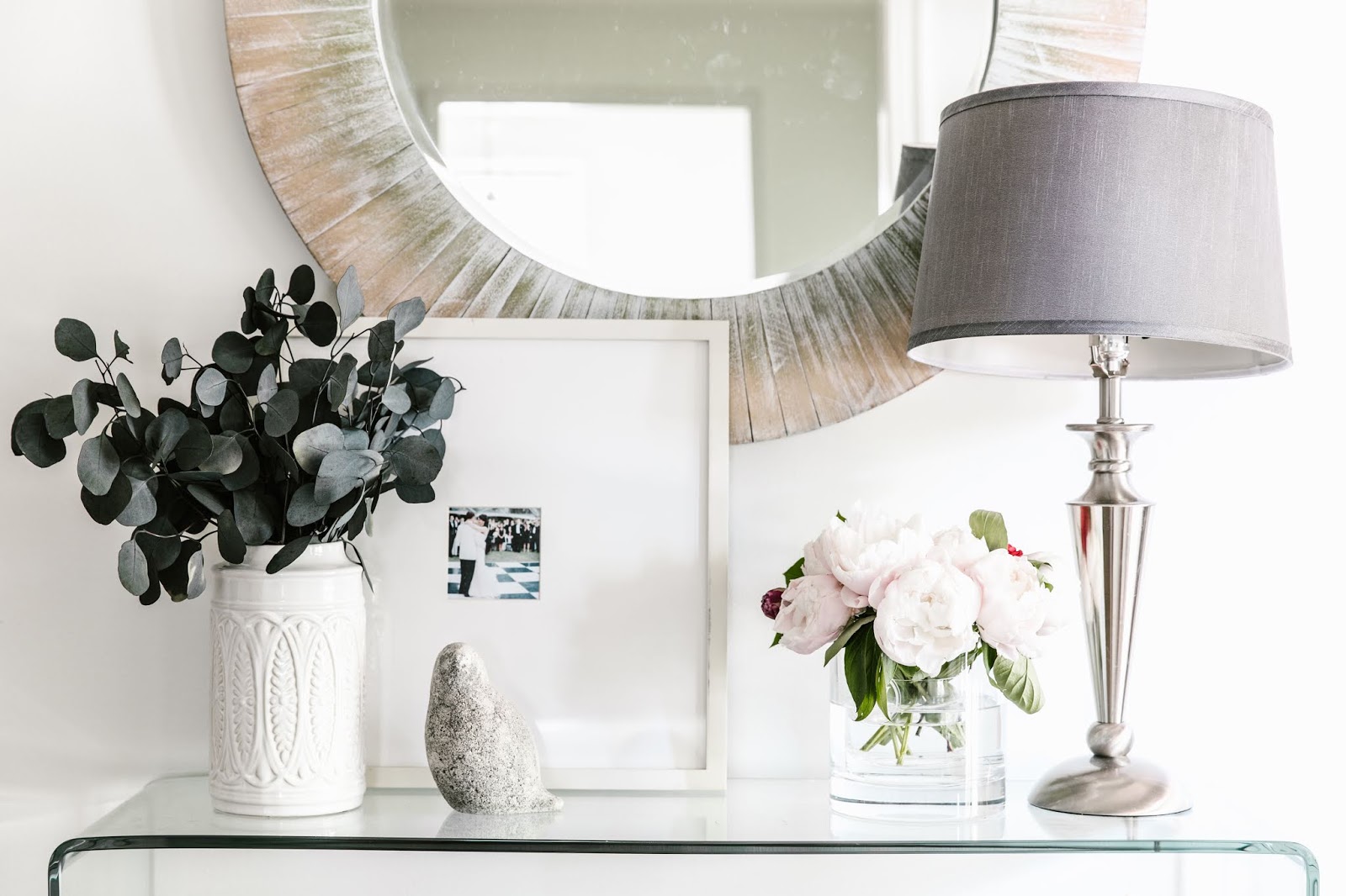
Here is another example of the rule of three used for styling this entry console table. The grouping on the left with the picture frame, ceramic vase, and stone figurine follows follow the rule of three because they are three different objects that work well together. The addition of the lamp and the vase also continue the rule of three making the entire group an odd number of five objects.
Now that you’ve seen how the rule of three works we also want to point out that you don’t always need to stick to the rule of three. If you were to use that rule in every vignette you style, your home will start to look predictable – and that is not something you want! You want to keep the occupant’s eyes interested throughout your space. So make sure to mix things up! Sometimes a surface only warrants one larger objects instead of a few smaller ones. Go with our gut, and if all else fails, head to Pinterest to get some inspiration.
Below is a few more of our favorite styled spaces to give you more ideas on how to style. And don’t forget to scroll to the bottom of this post to find some of our favorite pieces to style with that can at times be forgotten. Links are included so you can shop and start styling in no time!
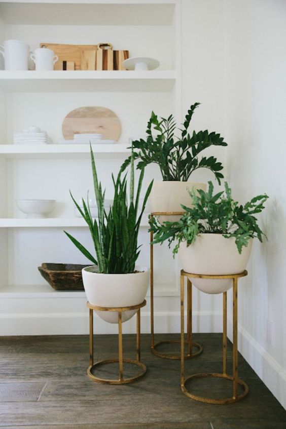
Love how the rule of three is used for these planters with varying heights. Plants are a great way to elevate your space or fill up an empty corner.
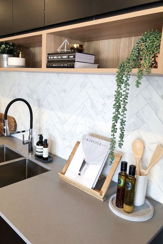
Yes, yes, yes! Great way to style your oils/vinegars and put your favorite cookbook on display (even love the open shelves above!) You can never go wrong with greenery.
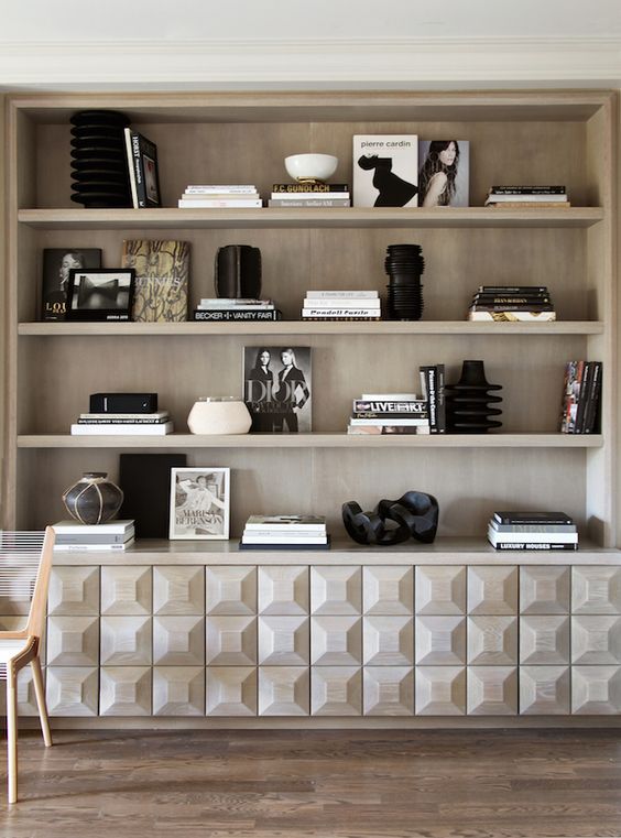
This monochromatic styled shelving is everything! Transitional meets minimalist with it’s clean lines and neutral pops of color. It’s a perfect example of stacking, layering, and grouping in odd numbers to acheive visual balance.
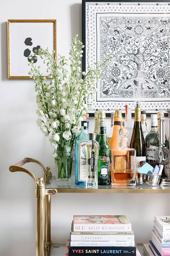
We love how this bar cart is styled! When beauty meets function. Don’t know what else to add to your bar cart other than the necessities? Add a vase with fresh flowers to give it a pop or stack your cookbooks to mix things up. You should get creative when styling and look for the unexpected.
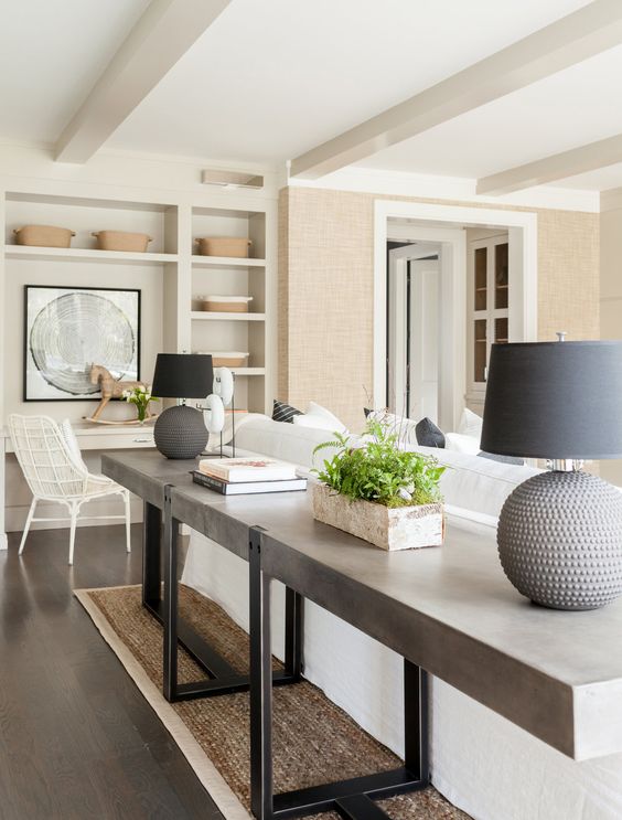
Adding a console table behind your sofa is a perfect way to have another surface for styling. If the back of your sofa is exposed it’s especially a good reason to put a console table there if room permits. It also provides a great way to add more ambient lighting through table lamps.
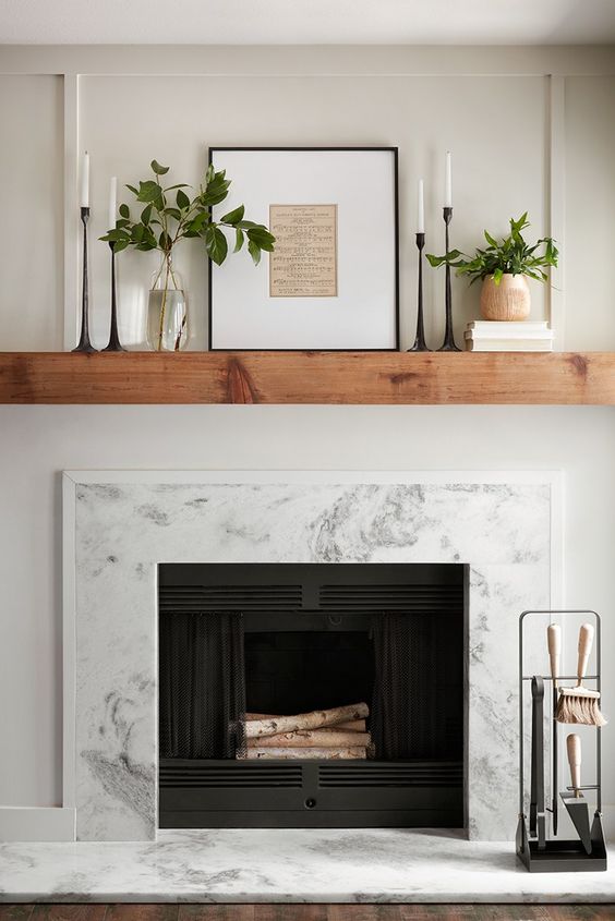
We love this mantle because it’s a mix of similar and different. The four identical candlestick holders are grouped in pairs of two and provide asymmetrical balance by being off center from one another. The tall glass vase with greenery is balanced perfectly with the shorter vase sitting on a stack of books. The center art piece grounds everything together nicely.
Some of our favorite pieces to use when styling categorized by room:
Kitchen
- Gold Metal Cookbook Easel
- Cookbook to go on easel (here are some of our faves to cook with right now: Simply Real Health, True Roots, Magnolia Table)
- Marble tray to hold your oils and vinegars
- Custom cutting board (or just one you enjoy looking at!) to prop up against your kitchen backsplash (layer it behind the oils/vinegars or another object to give more depth, also works as a way to hide unused outlets!)
- Marble kitchen utensil holder (to add some contrast have the utensil holder on one side of your oven and the marble tray on the other – since they are both marble it’s
Powder Bathroom
- Barr & Co. Hand Soap and Lotion Duo
- Vase with eucalyptus or other type of greenery (sits on vanity opposite side of soap, or if room is limited add it to tray above toilet, below)
- Two art pieces to hang vertically above toilet or horizontally on another wall (one, two)
Bedroom
- Lamp(s) for nightstand(s)
- Art piece to layer behind and offset of lamp (if you are designing for two nightstands, find a second art piece that has similar qualities and ties in with the first art piece). This could also be a framed photograph of you and your loved ones.
- Stack of small books (2-4) of your choice, could be what you’re reading at the moment or more decorative.
- Amber colored vase with a few strands of some greenery